MYZEN FRUIT LTD
Brand Identity · Marketing · Print · Packaging
CLIENT
Myzen Fruit Ltd
LOCATION
Hong Kong
THE BRIEF
A complete brand identity and visual communication system developed for MYZEN Fruit Ltd, a fresh produce business focused on presenting fruit and vegetables in a modern, premium and approachable way.
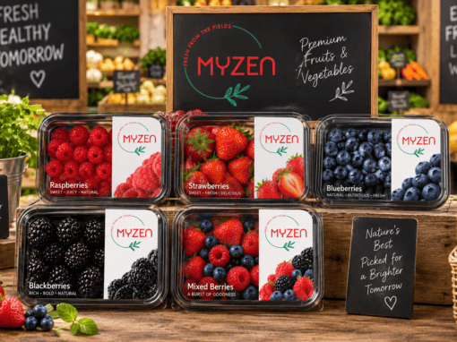
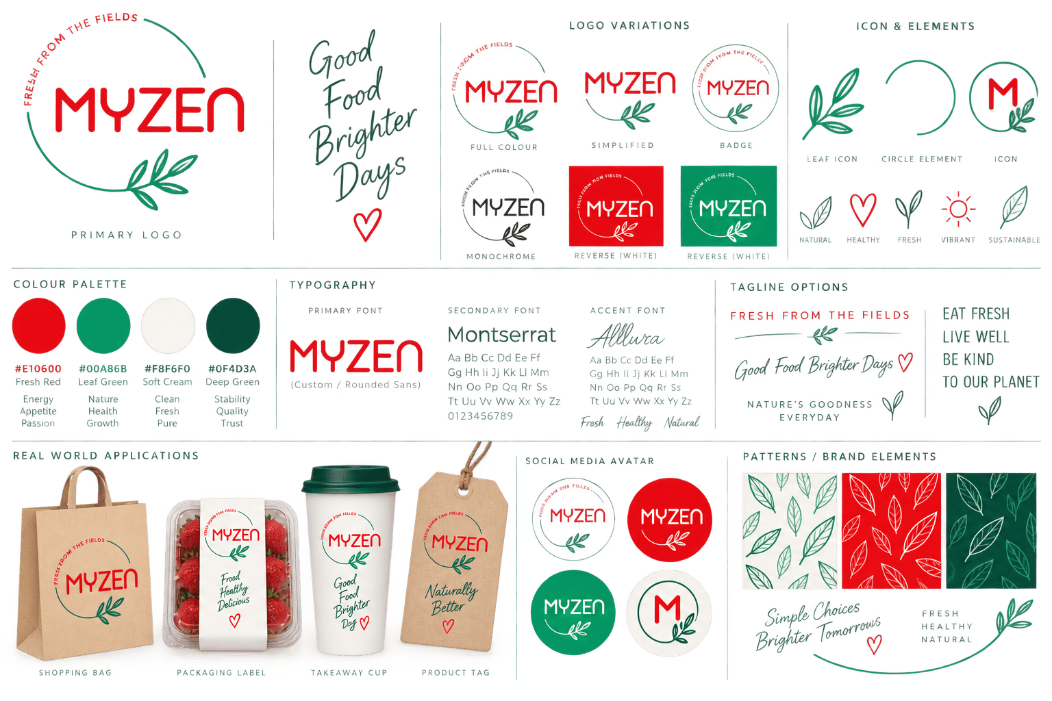
The project centred on creating a distinctive identity that communicates freshness, quality and a direct connection to nature. The MYZEN wordmark is paired with a simple botanical illustration and the “Fresh From the Fields” message, giving the brand a clean contemporary character while retaining the warmth and authenticity associated with fresh produce.
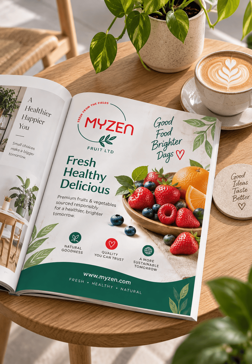
A bold red and green colour palette creates strong recognition across the identity. Red brings energy and appetite appeal, while green reinforces freshness, growth and natural produce. Clean typography and generous white space keep the brand feeling modern and commercially versatile.
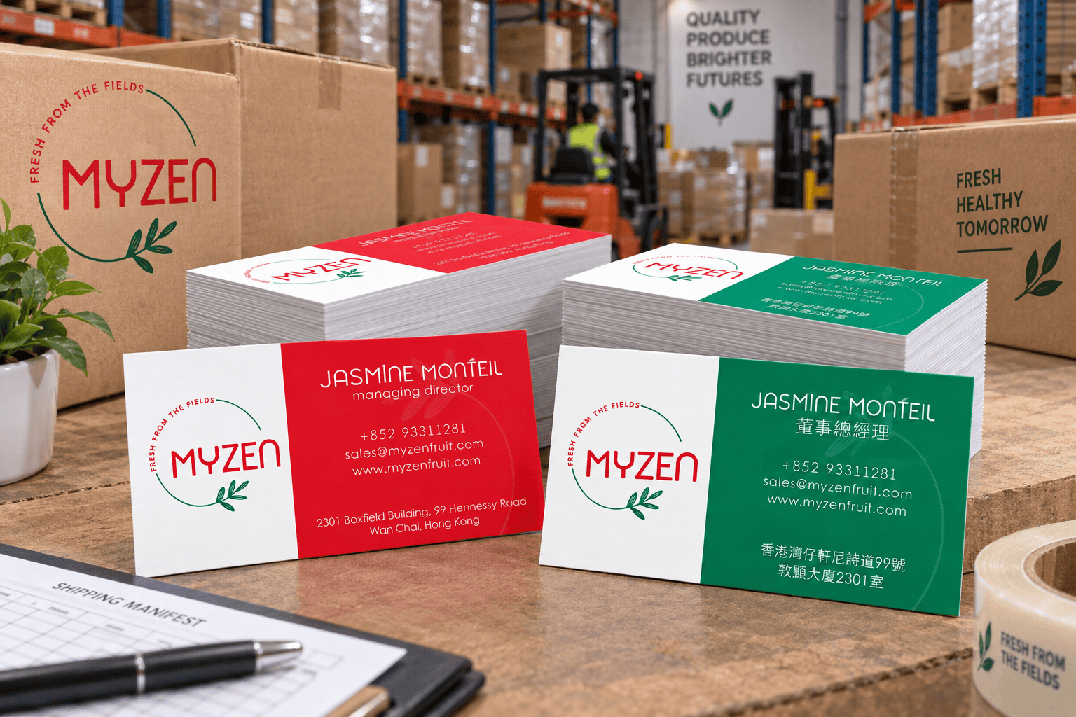
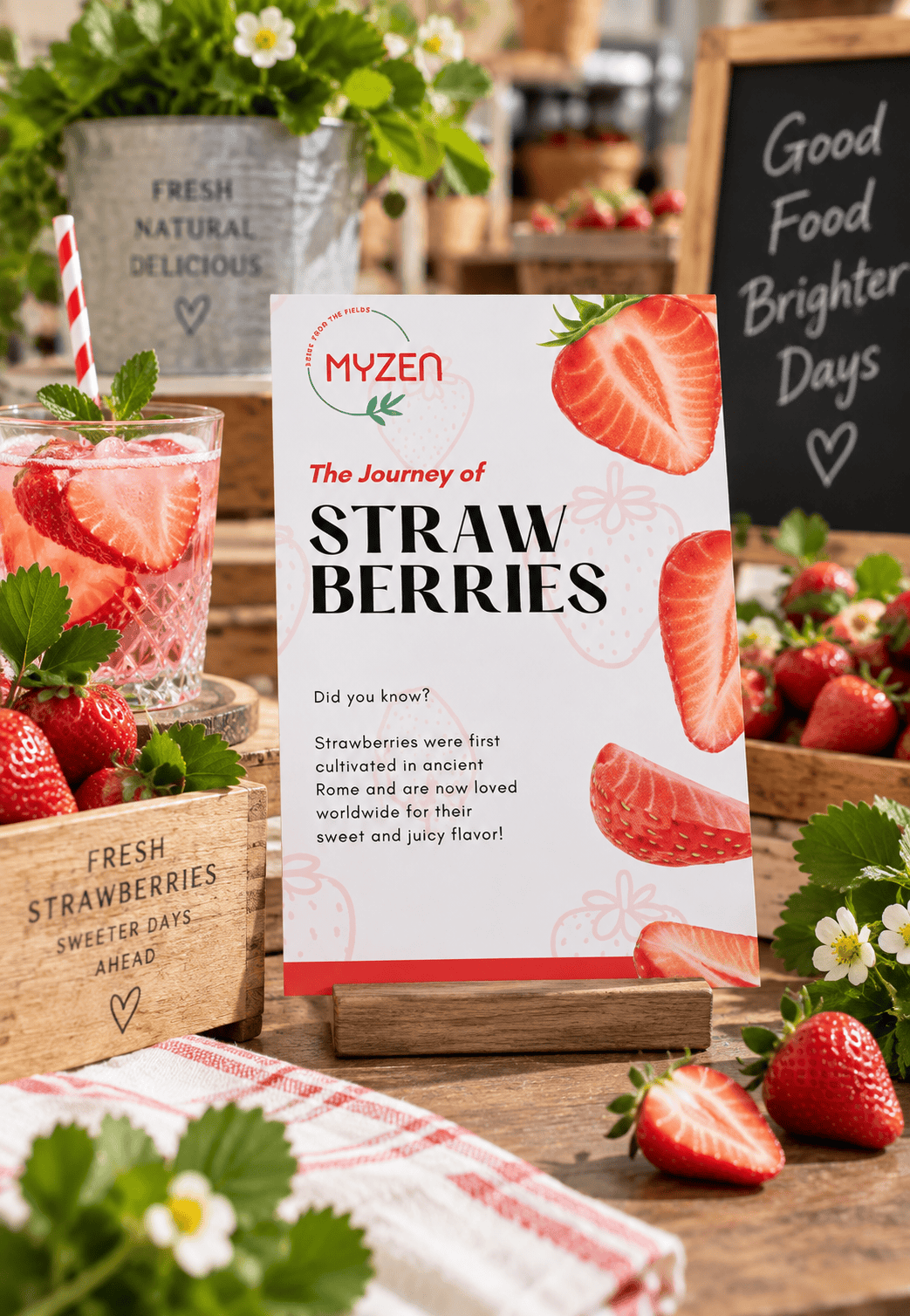
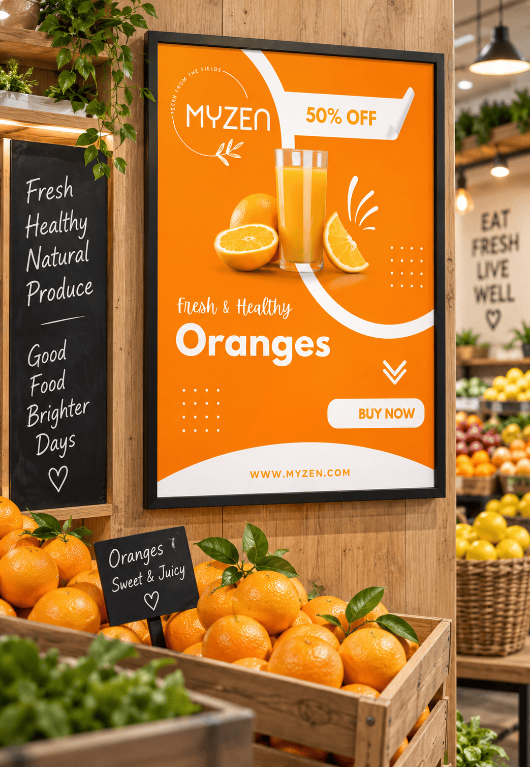
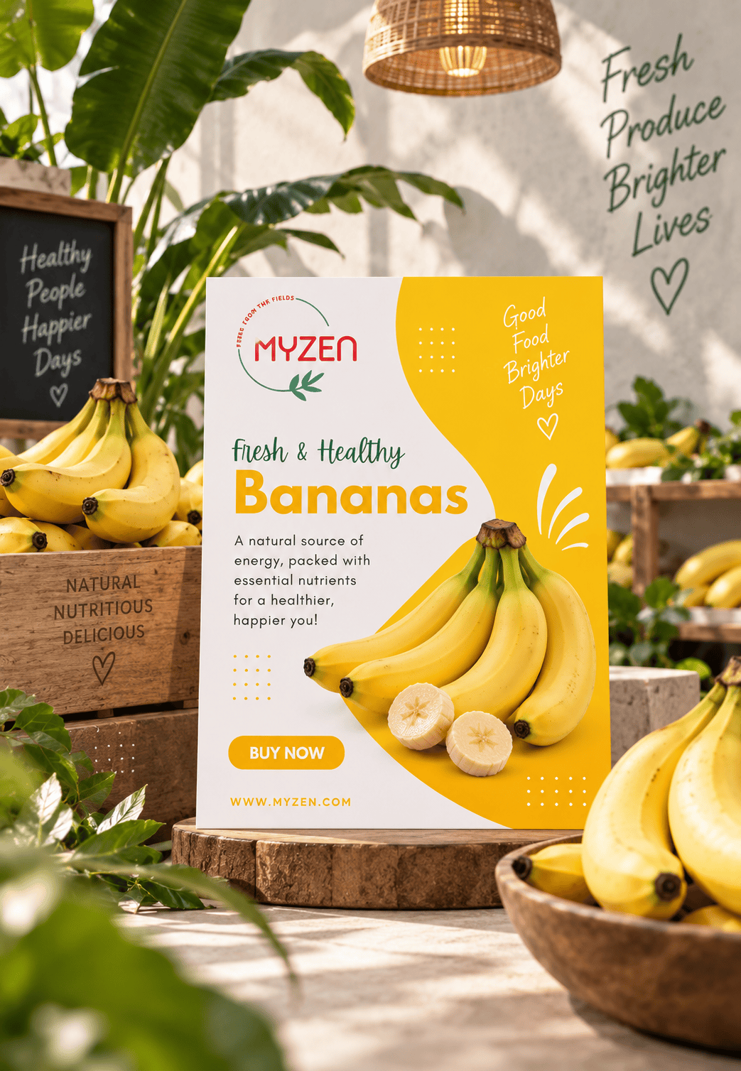
The identity was developed into a flexible brand system encompassing logo variations, typography, colour specifications, graphic elements, packaging, business cards, produce labels, promotional posters and retail applications. Individual fruit campaigns introduce product-specific colours and imagery while remaining recognisably part of the wider MYZEN identity.
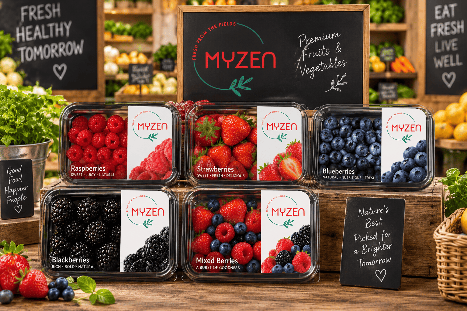
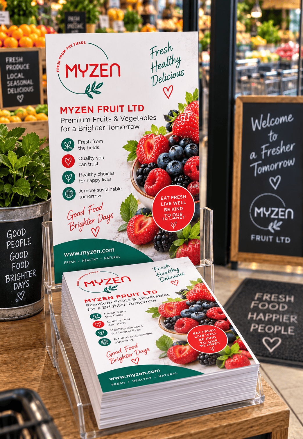
Packaging and point-of-sale concepts were also created to demonstrate how the brand could work within gourmet supermarkets, fresh produce stores and wholesale environments, from berry packaging and fruit labels to promotional signage and branded collateral.
The result is a cohesive identity designed to take MYZEN from field to packaging to retail, positioning the company as fresh, contemporary and quality-driven while maintaining a strong connection to the produce at the heart of the business.
Fresh from the fields. Simple choices. Brighter tomorrows.
BRANDING GUIDELINES
DESIGNS & MOCKUPS
MORE PROJECTS